

CrownThief: designing a premium brand in the age of AI
 Florent Dabernat
October 8, 2026
5 min read
Florent Dabernat
October 8, 2026
5 min read
In this article
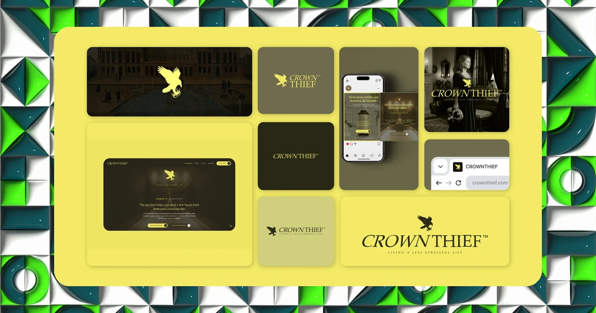
CrownThief is a conceptual cosmetics and wellness-ritual brand built on a simple promise: lightening the weight of daily life. I designed the entire creative core by hand, and let AI produce only the declinations, from my rules.
A concept: lightening the weight of daily life
It all starts with one idea: living a less stressful life. The crown, a symbol of royalty, here embodies the weight of responsibilities and daily pressure. A raven steals it, and frees you from it. From that story comes the symbol, a raven stealing the crown, and the whole art direction follows.
The logotype is a patinated serif that inspires calm and distinction. The art direction is cinematic: soft light, noble materials, and a vivid yellow that signs every statement, over a sober, eco-responsible palette.
The creative core, entirely human
What matters in this project is not that it uses AI, it is where it uses it. The concept, symbol, logotype, palette and art direction all come from me. These are decisions of meaning, not execution, and that is precisely what cannot be delegated to a machine.
Before a single generation, the brand already exists as a coherent system: a promise, a symbol, rules. That base is what makes everything else possible.
AI does not create the brand, it declines it. The concept and art direction remain a human decision.
CrownThief, IDSEED conceptual project
AI for the declinations, not the decisions
Once the core was set, I formalized my rules in a DESIGN.md file: colours, typography, mood, what is allowed and what is not. From that single file, AI quickly produces the images, motion, packaging and social assets, without ever drifting from the identity.
From face serum to spa ritual, from website to Instagram feed, every touchpoint breathes the same atmosphere. Not because AI is talented, but because it applies a frame written in advance.
A mass-produced identity does not lose its soul as long as a human decision comes first. The written frame is what separates a coherent brand from a pile of generic visuals.
One source, every output
The result is a premium brand born from an art-direction-then-AI flow: coherent from symbol to touchpoint, produced faster and infinitely declinable without losing its soul. One source feeds the logo, the images, the product, the social and the web, gathered into a single visual system.
Want a brand designed as a system, human at its core and declinable by AI? That is the principle of the brand foundation I build with my clients. Start with IDSEED's free brand audit.
Frequently asked questions
-
Can you hand an entire brand identity to AI?
- No, not the core. The concept, symbol, logotype and art direction require a human decision. AI is excellent at declining fast from clear rules, not at inventing a brand's meaning.
-
What is a DESIGN.md file for in a brand project?
- It translates the guidelines into explicit, machine-readable rules: colours, typography, tone, dos and don'ts. From this file, AI produces images, motion and assets without drifting from the identity.
-
What does the art-direction-then-AI flow save?
- Speed and near-infinite declination, without losing consistency: one source feeds the logo, product, social and web. The time saved goes into design, not repetitive execution.