

The law of Prägnanz: the eye always seeks the simplest form
 Florent Dabernat
November 22, 2026
4 min read
In this article
Faced with a complex or ambiguous image, the brain does not keep every detail: it reduces it to the simplest, most regular and most stable form possible. This is the law of Prägnanz, sometimes called the law of good figure or the law of simplicity.
Formulated by the Gestalt psychologists in the early twentieth century, it sits above all the others: proximity, similarity and continuity all flow from it. Our perception is a simplifying machine, and effective design works with it, not against it.
The principle
Looking at the Olympic rings, we see five interlocking circles, not a series of cut-out arcs. The brain always chooses the most economical reading. The simpler and more ordered a form is, the faster it is perceived, the more easily it is remembered, and the more reliably it is recognised in any condition: very small, from far away, or out of the corner of the eye.
What it means in design
- A logo must hold in a simple form. If it takes effort to decode, it does not stick. The strongest brands come down to a clean silhouette, legible even in black at 16 pixels.
- A readable interface cuts the noise. Fewer edges, shadows and useless details: the eye finds the structure faster and cognitive load drops.
- Perceived simplicity beats actual simplicity. What matters is that the whole looks ordered and obvious, even when the underlying work is complex.
That is the whole point of a logo: every mark in my logofolio is built to hold in a simple form, recognisable at a glance.
Good form is not the poorest one, it is the clearest: the one the eye understands without thinking.
Good form is engineered
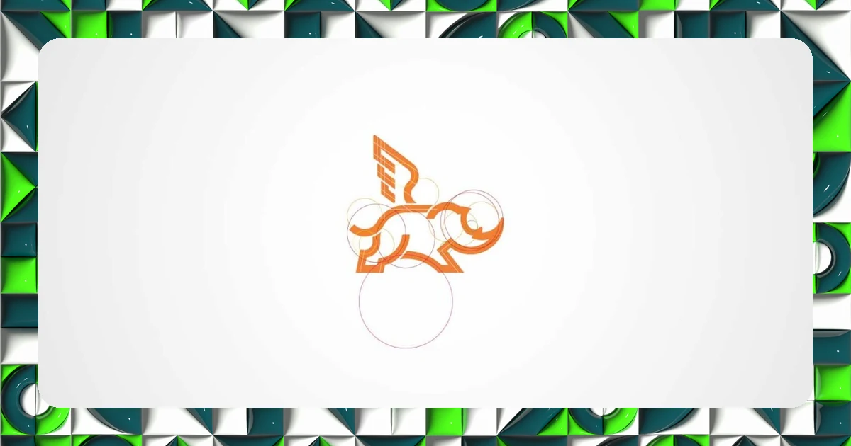
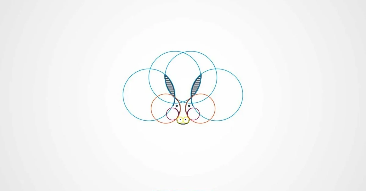
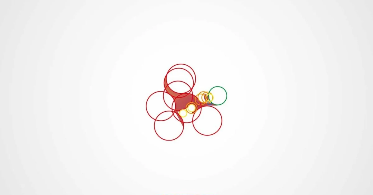
This perceived simplicity does not come from nowhere: it is engineered. Behind a logo that looks obvious, there is often a grid, circles and proportions tuned to the golden ratio. You start from a rich subject and reduce it to a chain of simple geometric shapes that lock together.

By overlaying circles with proportional radii, you get regular curves that the eye reads as a single, coherent shape. The result looks simple precisely because its construction is rigorous.
The common mistake
Trying to say everything in a single sign. By piling on details, gradients and elements, you build a form the brain can no longer simplify: it rejects it or distorts it. Too much complexity kills recognition.
The other trap is ambiguity: a form that can be read two ways leaves the brain to choose, rarely the way you intended. The law of Prägnanz is not a style option, it is a perceptual constraint.
Simplifying is not impoverishing: it is removing until only the recognisable essential remains. A simple, well-built form is remembered, declined and survives at any size.
In practice
You remove down to the essential, align to a grid, and check that the form holds very small and in a single colour. This discipline is what makes a brand identity solid and declinable everywhere, even when produced by other hands or by an AI. To see the principle applied, browse the logofolio.
Frequently asked questions
-
What is the law of Prägnanz?
- It is a Gestalt principle: faced with a complex or ambiguous image, the brain keeps its simplest, most regular and most stable version. It is also called the law of good figure or the law of simplicity.
-
Why is a simple logo more effective?
- Because a simple form is perceived fast, remembered, and stays recognisable very small, in a single colour or from far away. The more effort a logo takes to decode, the less it sticks in memory.
-
What is the golden ratio for in logo construction?
- To tune the proportions between circles and curves so the ratios stay regular. The eye reads that regularity as a harmonious, stable form: it is what gives the impression of obvious simplicity.