

CHARLI is one of the most famous bakeries in Brussels.
 I was commissioned to redesign the entire visual identity and all the related deliverables based on my recommendations.
Date:
December 2024
Role:
Branding - Art direction - UX/UI design
Branding:
- Typographic logotype,
- Packaging,
- Print materials.

UX/UI design:
- Figma,
- Accessibility,
- Eco-production.
A bold image for a Brussels institution.
The context
CHARLI is one of Brussels' most renowned bakeries. Its image no longer reflected its standing, so I rethought its entire visual identity and supporting materials.
The approach
A coherent brand system: logo, graphic world, packaging and communication materials. Built hand in hand with the interior architect, for an experience aligned from logo to shop.

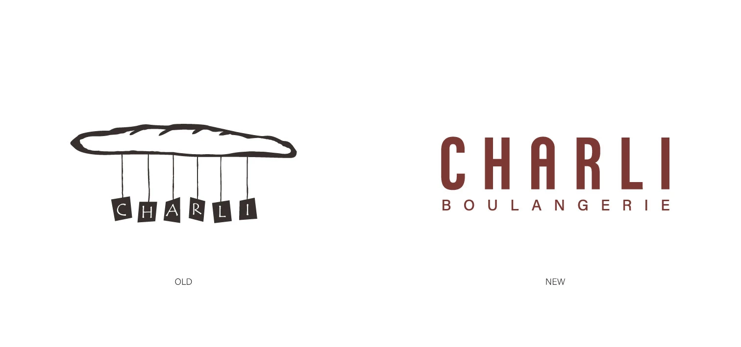
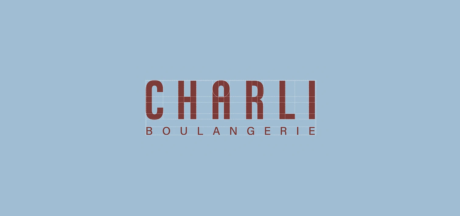
The logotype
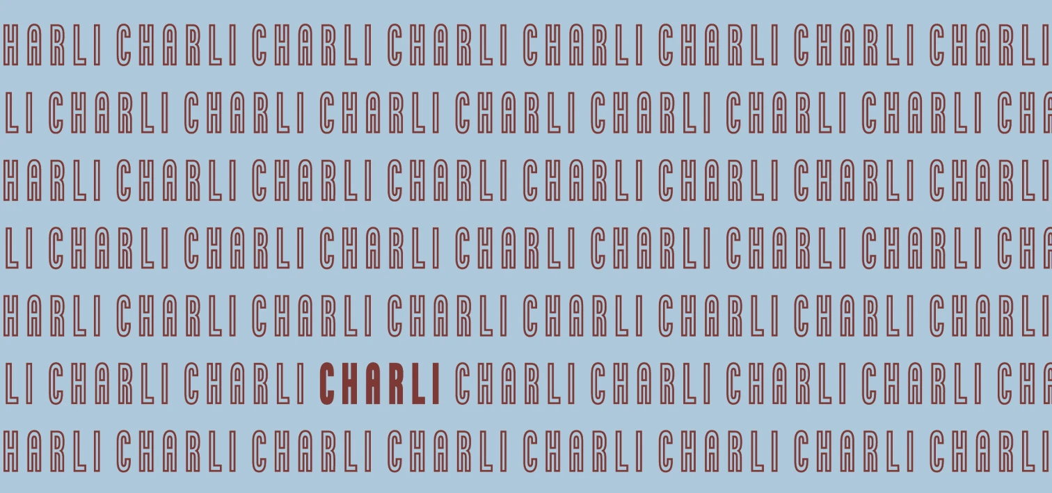
A typographic logo, built to last and to be remembered instantly.
The visual world
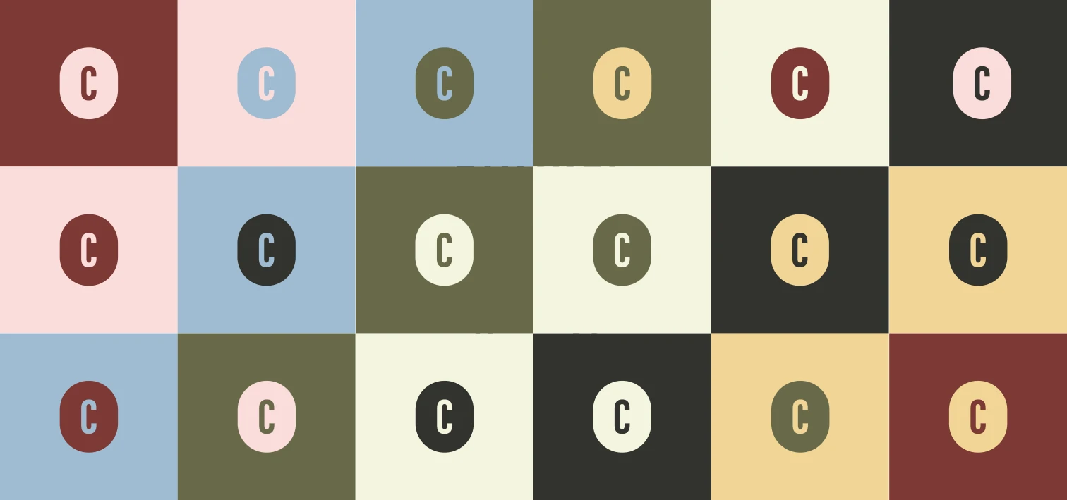
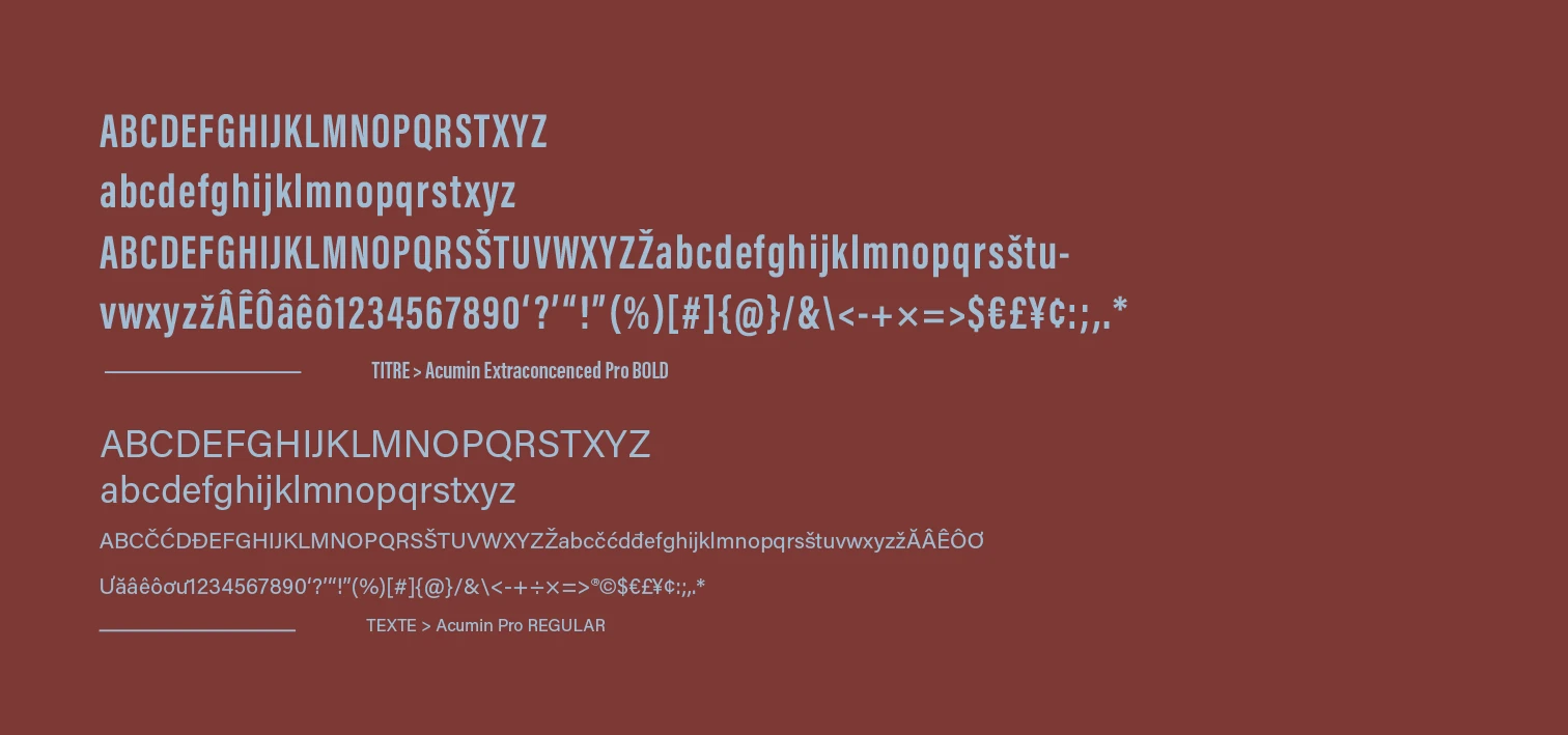
Colours, motion and typography set the atmosphere of the house.
The materials
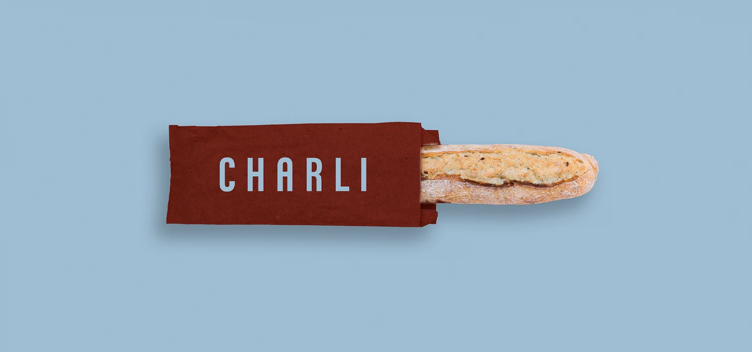
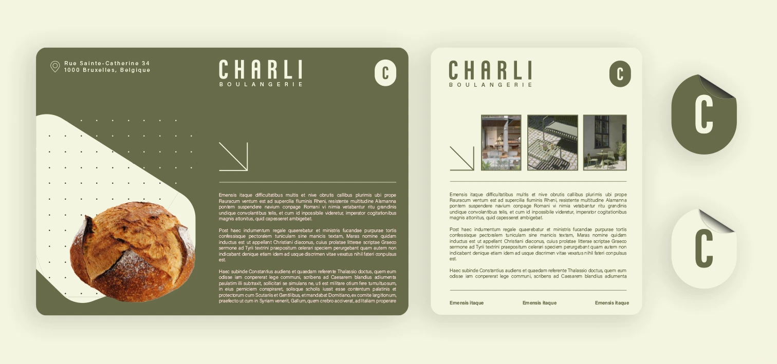
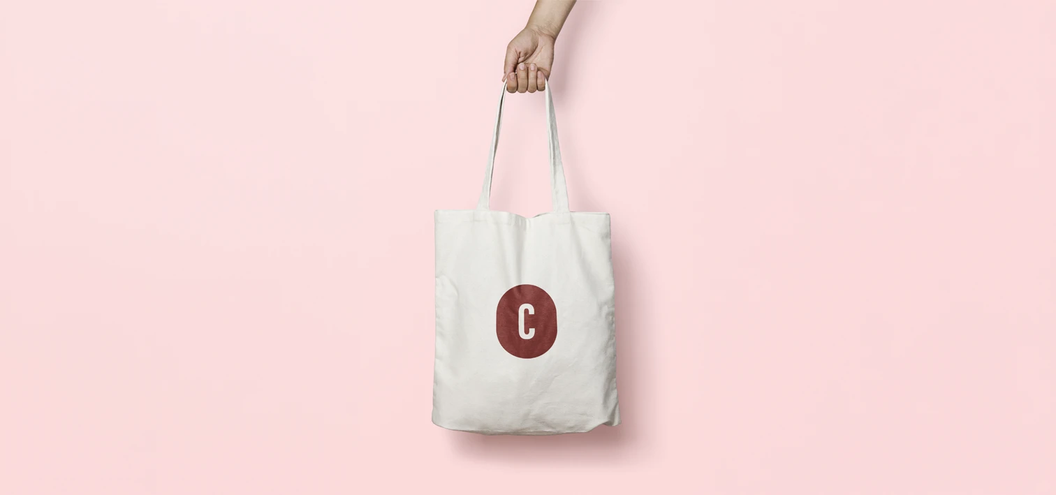
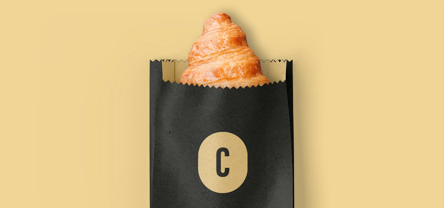
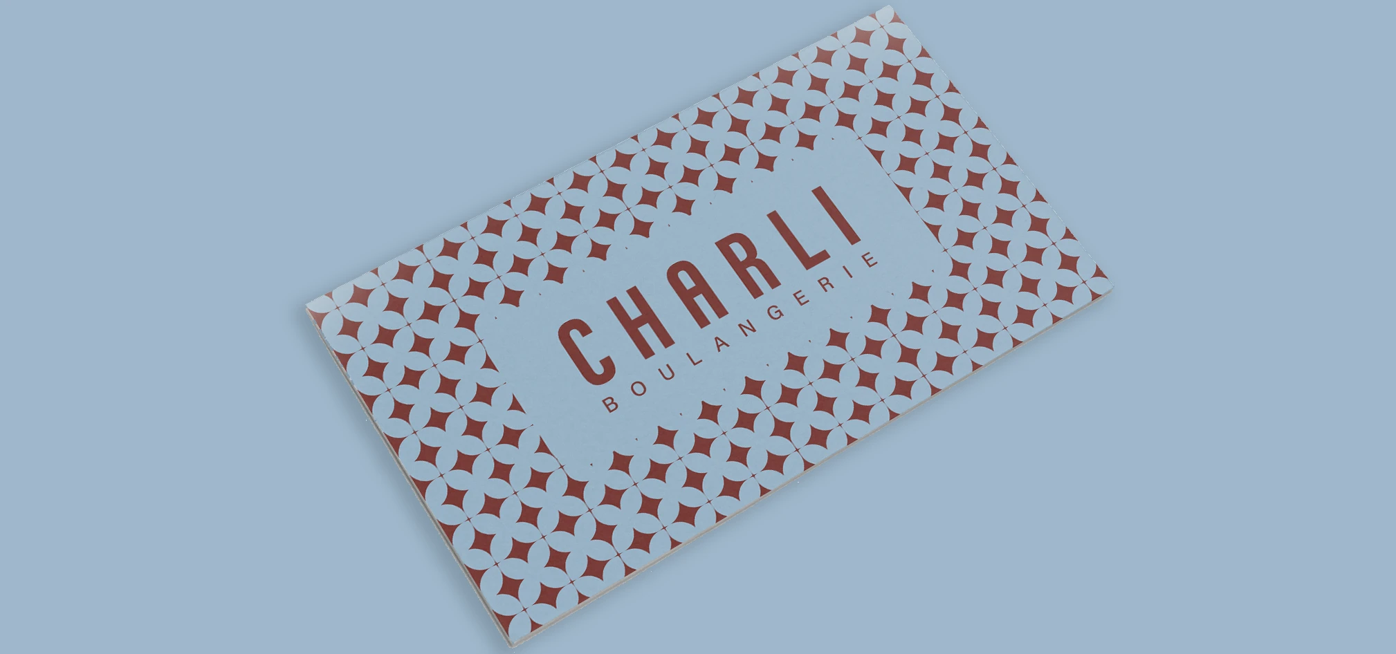
From packaging to cards, an identity present at every touchpoint.
The shop & digital
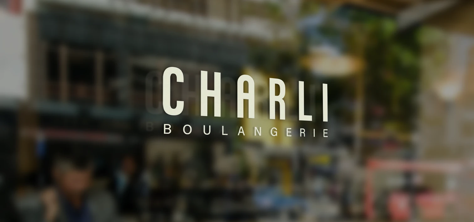
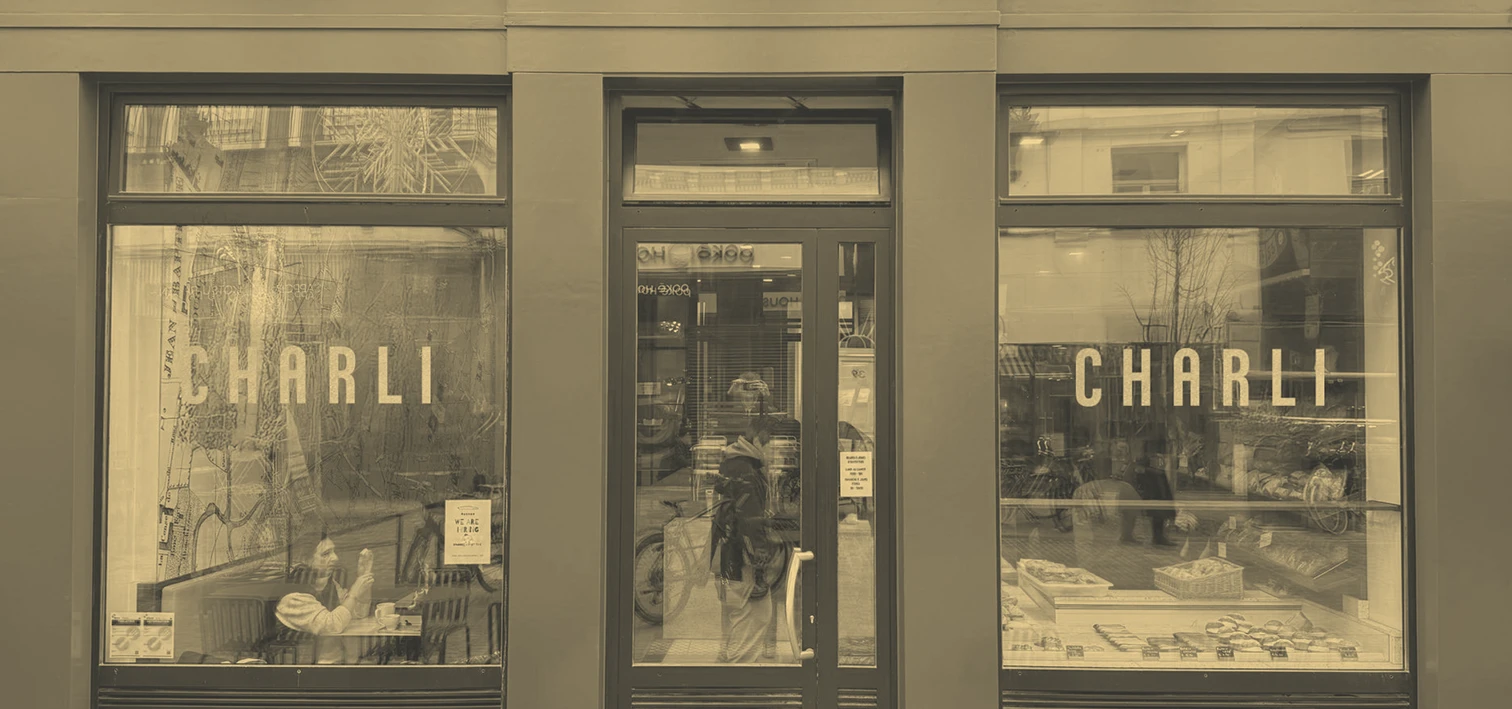
From storefront to website, a consistent experience in-store and online.
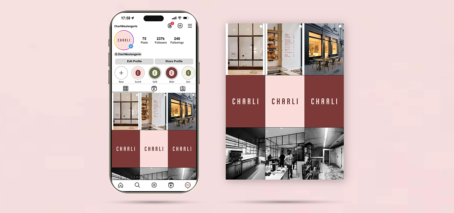
Overview of the art direction:
Results:
A more impactful visual identity with strong memorability that increases the loyalty rate.
Client testimonial:
"Ce fut un grand plaisir de travailler sur ce projet avec Florent ! Toujours à l'écoute du client, réactif et rigoureux, la conception de l'identité visuelle a été super fluide ! Je recommande +++ pour tous vos projets!"
 Back to portfolio
NEXT PROJECT