

Le Petit Chamarel is a restaurant / catering concept including click&collect, run by a Mauritian chef in the heart of Marseille. Cooking with local produce where everything is homemade!
 I was commissioned to create the complete visual identity and all related needs based on my recommendations.
Date :
June 2021
Role :
Branding - Art direction - UX/UI design - Hosting
Branding :
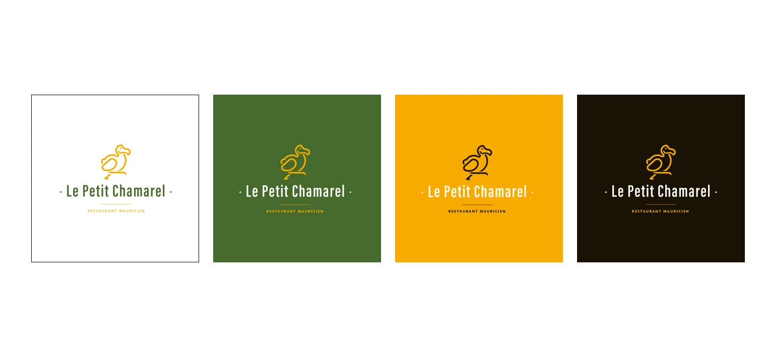
- Modular logotype,
- Graphic variations,
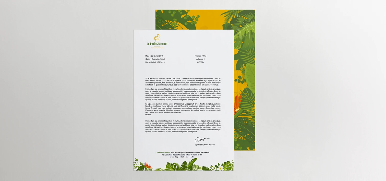
- Print materials.

UX/UI design :
- Wordpress,
- Mobile first,
- SEO.
A brand that makes you hungry.
The context
Le Petit Chamarel, a Mauritian restaurant, needed its brand image and customer experience rethought from the ground up.
The approach
A coherent visual identity and a high-performing website: UX/UI, art direction and brand strategy for an online presence worthy of its cuisine.

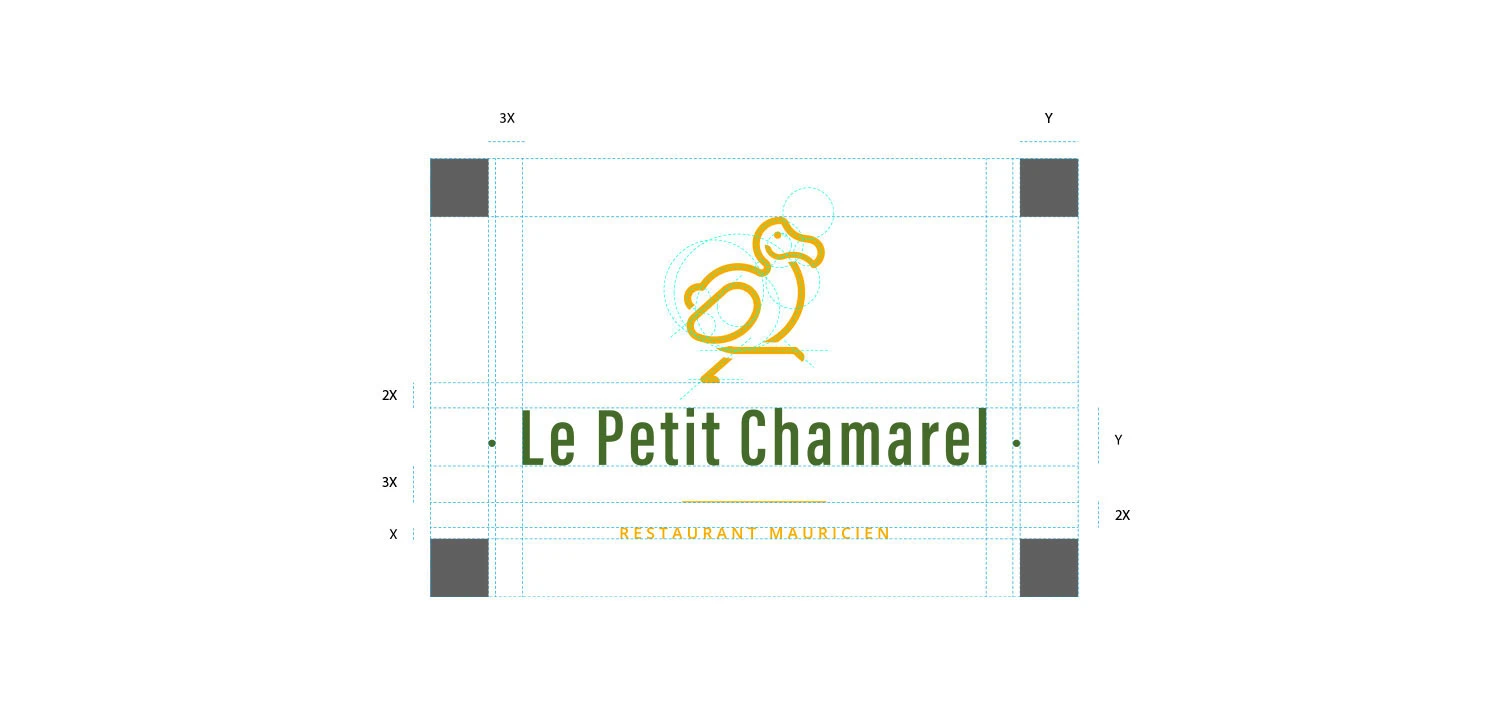
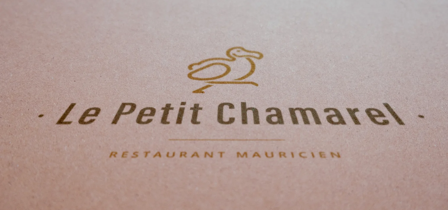
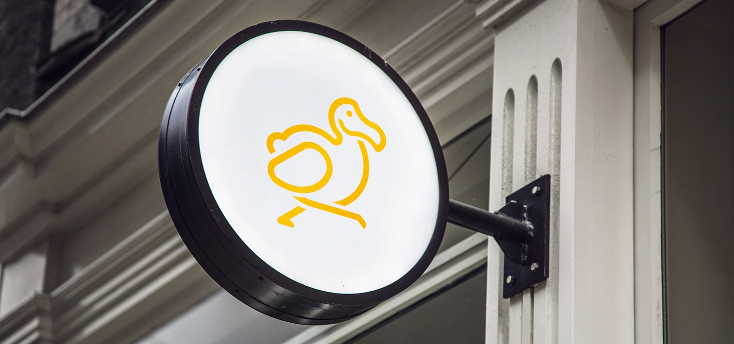
The visual identity
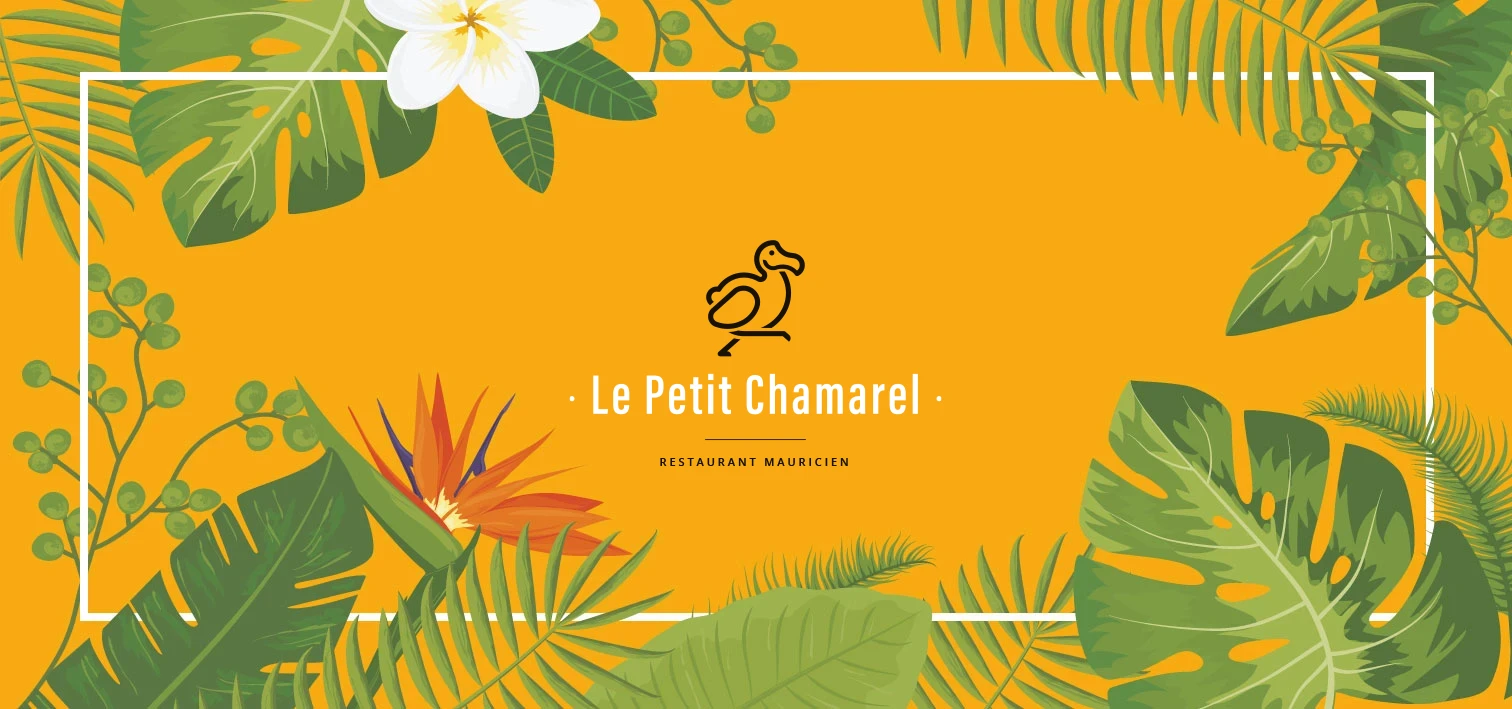
Colours, patterns and logo set the warm atmosphere of the house.
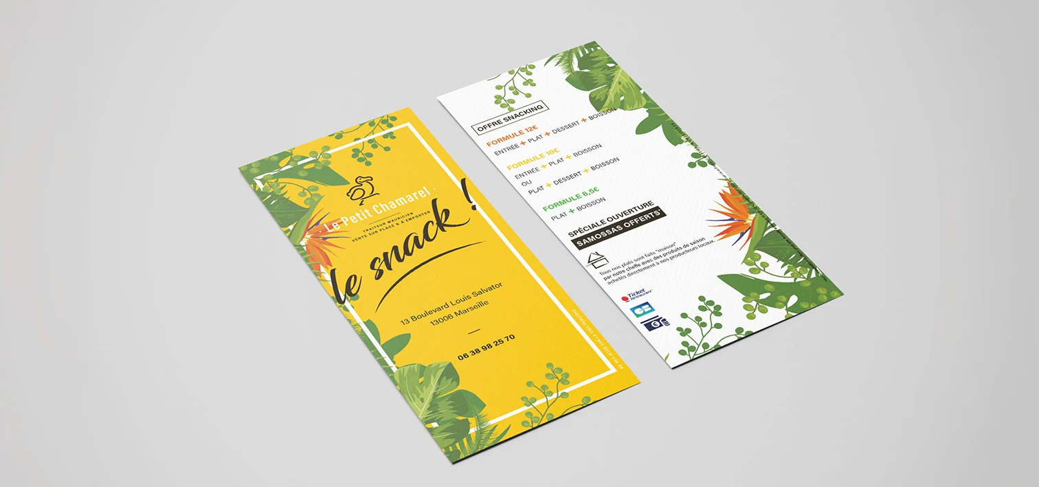
The materials
From stationery to flyer, a mouth-watering identity on every support.
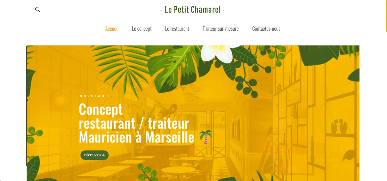
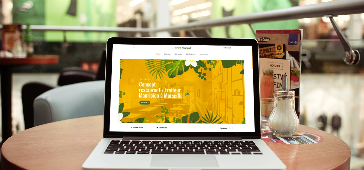
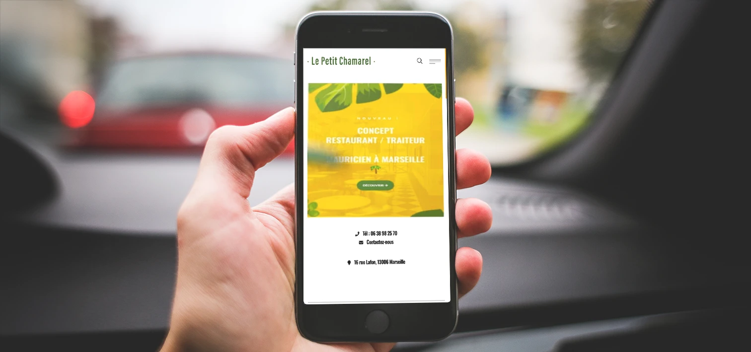
Digital
A website that extends the experience and makes you want to book.
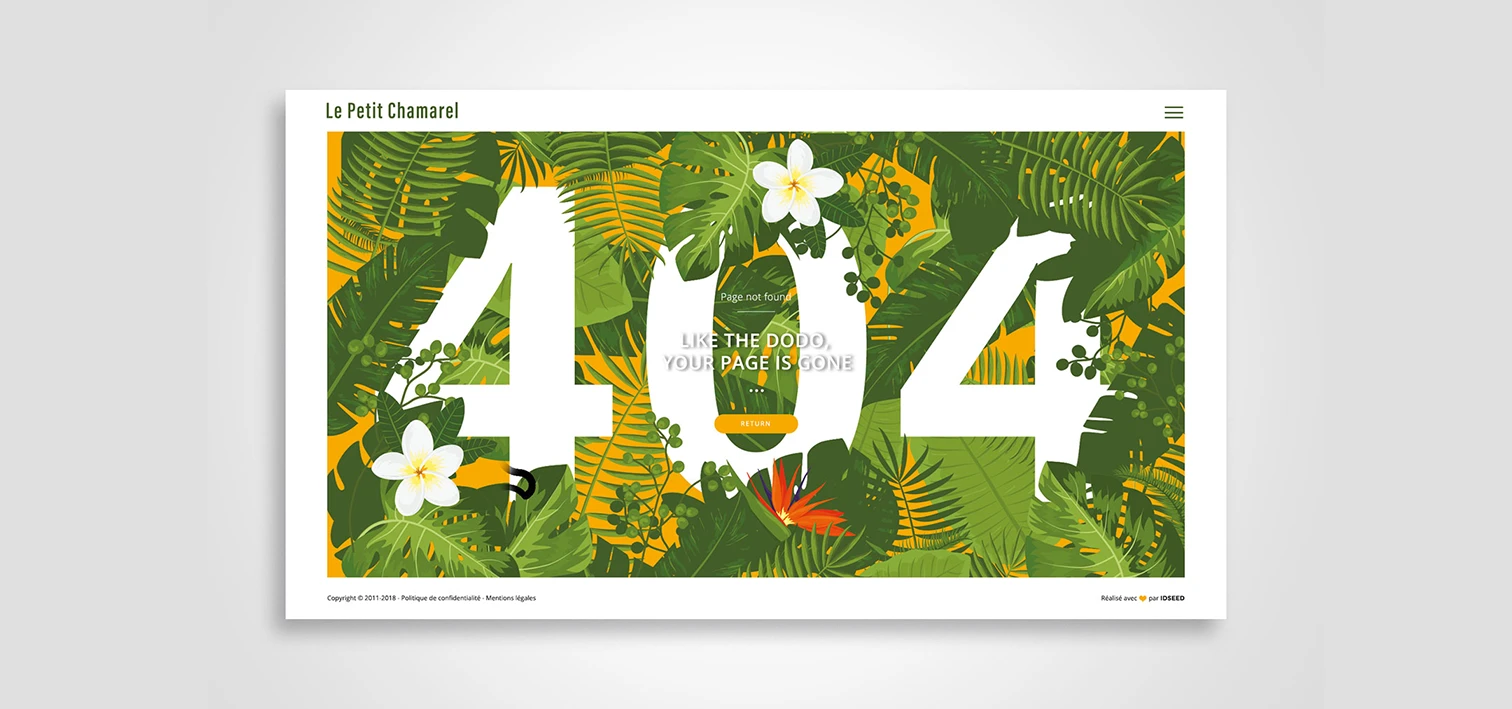
Art direction overview :

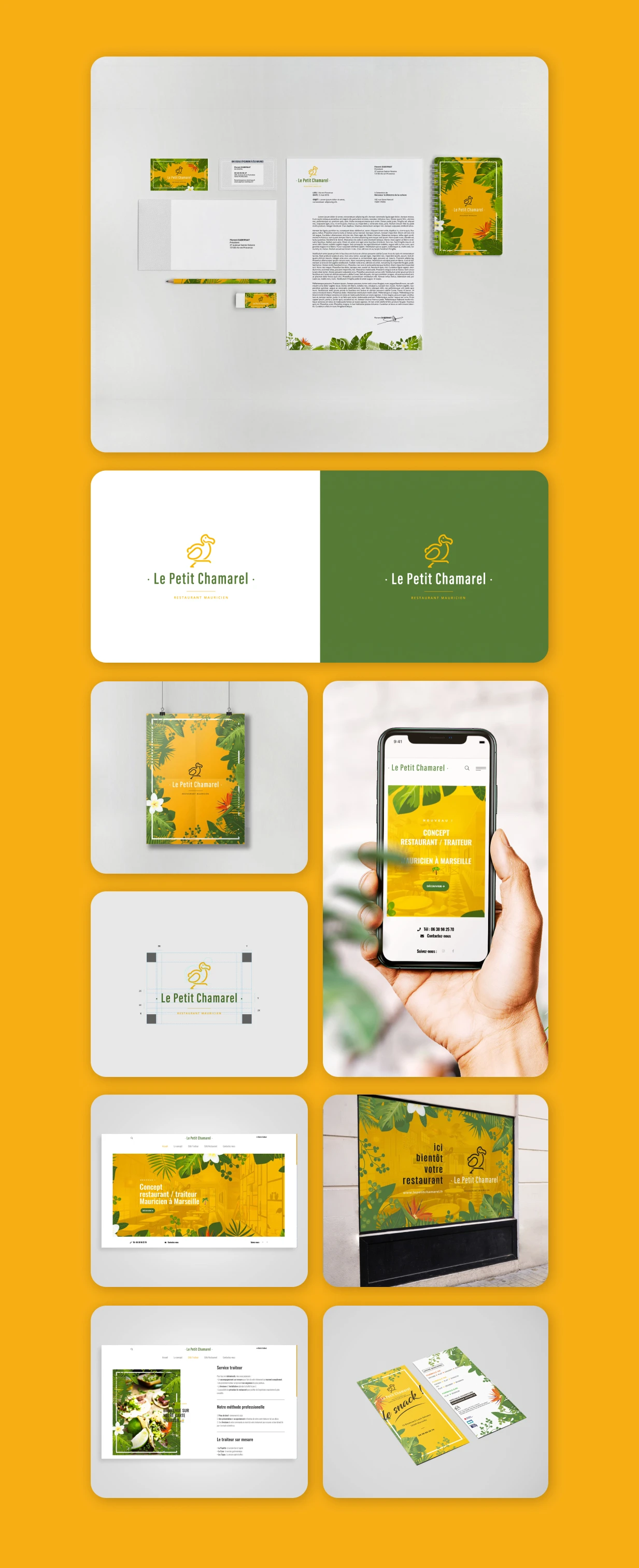
Results :
A complete and personalised support for the concept launch and the long-term sustainability of the project.
Client testimonial :
"Je n'ai pas vu de logo DODO plus beau ... Merci à Audrey et Florent pour leur travail !"
 Back to portfolio
NEXT PROJECT