

Pivot Groupe: clarifying a technical offer through design
 Florent Dabernat
March 19, 2026
2 min read
Florent Dabernat
March 19, 2026
2 min read
In this article
Pivot Groupe specializes in building and managing web infrastructure. As is often the case in technical trades, the company was doing solid work, but its offer remained hard to understand from the outside.
An offer that was hard to read from the outside
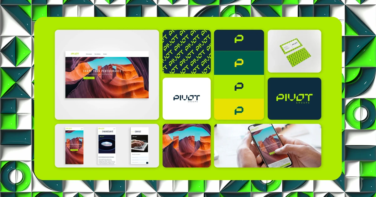
I was brought on to create the entire visual identity of Pivot Groupe and everything that comes with it. The image overhaul and the creation of digital materials aimed to clarify the offer and modernize the brand, combining graphic design, UX/UI design and communication strategy.
The goal was twofold: improve the legibility of the services on offer and strengthen the online presence, with a design approach focused as much on understanding the offer as on converting visitors into clients.
A typographic logo recognizable at a glance
The choice landed on a typographic logotype, rounded out with a full brand guideline and a motion iconography project. This last variation, animating the icons of the graphic system, helps bring more life to an offer that's inherently rather abstract (hosting, infrastructure, technical management).
On the digital side, the site was built on WordPress, mobile first and SEO-optimized, with an architecture designed to guide visitors toward a quick understanding of the services, a prerequisite for any conversion.
Florent is creative... and above all passionate. He's easy to reach and always energetic.
Client testimonial, Pivot Groupe
On a technical offer, clarity beats visual sophistication: a visitor who doesn't understand what you offer within a few seconds will never convert, no matter how good the design is.
The results
The result is a modern image suited to current constraints, carried by a custom typographic logo that's recognizable at a glance. The legibility of the offer is directly strengthened as a result, an essential prerequisite for any online conversion strategy.
Want to know where your own brand stands? Take IDSEED's free branding audit: twenty questions to get an objective read on your current positioning.
Frequently asked questions
-
How do you make a technical, abstract offer legible?
- By pairing a clear visual identity with content that concretely explains the services, often through icons, diagrams or motion design that give a tangible shape to hard-to-visualize services.
-
What does motion iconography bring to a brand identity?
- It brings a static icon system to life, which helps capture attention and ease the understanding of technical services, particularly useful on a site where visitors need to grasp a complex offer quickly.
-
Does the clarity of an offer have a direct impact on conversion?
- Yes, it's often the number one factor: a visitor who doesn't understand exactly what they're getting hesitates or leaves, regardless of how good the rest of the experience on the site is.