

Sémaphore Médias: a lasting identity for a long-standing partner
 Florent Dabernat
March 16, 2026
3 min read
Florent Dabernat
March 16, 2026
3 min read
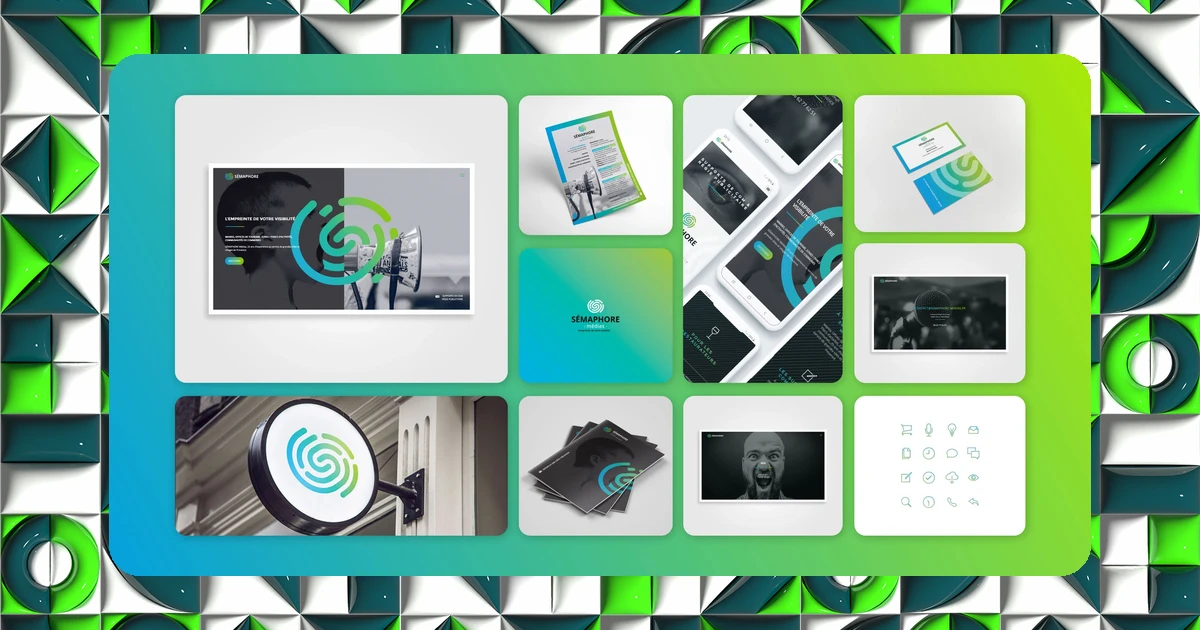
Sémaphore Médias specializes in ad placement and creating tourism-related materials in the PACA region of France. The initial project led to something rarer: a partnership that's lasted for years.
One identity, one partnership
I was brought on to create the entire visual identity of Sémaphore Médias and everything that comes with it. Creating a visual identity and a communication strategy aimed to strengthen brand consistency and the impact of its materials, in a sector, tourism and advertising, where message clarity is decisive.
Since then, we've become partners: a client who stays on beyond the initial project is often the best signal that a brand identity has genuinely delivered on its promises over time.
Message clarity above all
The work relied on a modular logotype and the use of negative space, the same family of techniques used on other portfolio projects, but adapted here to a sector where legibility at a distance and in small formats (advertising materials) is a constant constraint.
The approach put the emphasis on message clarity and visibility, with an art direction designed to support the media company's reputation and credibility over time, rather than a one-off visual effect.
I work regularly with Florent Dabernat and our exchanges are always efficient. He manages to understand and target client issues to create rich, impactful visual worlds.
Client testimonial, Sémaphore Médias
A partnership that lasts over time is often the most reliable sign that a brand identity was well built from the start: it keeps serving the client long after the initial delivery.
Tools built to last
The result: years of tailored support, an identity and digital tools that remain durable over time. The brand hasn't needed a deep overhaul since its creation, a sign of a base solid enough to absorb the natural evolution of the business.
Want to know where your own brand stands? Take IDSEED's free branding audit: twenty questions to get an objective read on your current positioning.
Frequently asked questions
-
How do you know if a brand identity will "hold up" over time?
- A lasting identity rests on simple foundations (a limited palette, a robust typography, a modular logo system) rather than on trends. It needs to be able to absorb the business's evolution without a full overhaul.
-
Why is legibility at small sizes so important in advertising?
- Because an advertising placement is often seen for just a few seconds, from a distance or at a small size. A logo that's too detailed or text that's too thin loses its legibility, and therefore its effectiveness, under those conditions.
-
Does a long-term partnership change how you work with a client?
- Yes: the relationship becomes smoother, the client already knows the working methods, and new requests fit into an already established consistency rather than starting from a blank page every time.