

Bernigaud Traiteur: repositioning a craft brand without losing its story
 Florent Dabernat
March 1, 2026
3 min read
Florent Dabernat
March 1, 2026
3 min read
In this article
Vincent Bernigaud is a caterer at the heart of Burgundy. His craftsmanship needed no proof. His logo, though, had been made by his own hand years earlier: repositioning it without losing what made it distinctive was the whole challenge.
Real craftsmanship, an image that no longer kept up
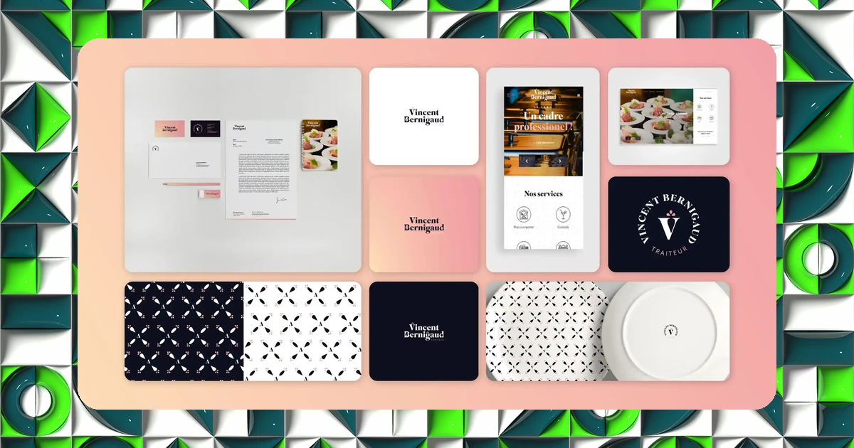
I was brought on to rethink the entire visual identity of Bernigaud Traiteur and everything that comes with it. The goal: to showcase genuine culinary craftsmanship through a consistent visual identity and communication materials, to strengthen visibility and appeal with customers.
This is a common case among long-established artisans: the quality of the craft has far outpaced the quality of the image representing it. The risk here wasn't a lack of ambition, but going too far and losing the recognition built over years.
Repositioning without denying
The work relied on a modular logotype and the use of negative space, a technique that creates a second reading within a logo without multiplying graphic elements. A way to gain sophistication without losing the simplicity that had always defined the brand.
On the digital side, the site was built on WordPress, mobile first, and optimized for organic search: technical foundations meant to last, not just accompany a fresh coat of visual paint.
Florent rethought my image after years of communicating with a logo I'd made myself. He managed to surprise everyone by proposing a timeless logo that still follows on from the story I've been writing for years.
Vincent Bernigaud, Bernigaud Traiteur
Repositioning a craft brand isn't about erasing its history: it's about giving it a form worthy of the craftsmanship it already represents.
The results
The result: a logo and brand image repositioned with a genuine step up in quality, without breaking from the identity that longtime customers already recognized. It's precisely this balance, between continuity and evolution, that let the client recognize themselves in the final result from the very first presentation.
Want to know where your own brand stands? Take IDSEED's free branding audit: twenty questions to get an objective read on your current positioning.
Frequently asked questions
-
How do you reposition a brand without losing longtime customers?
- By keeping the elements that drive recognition (a color, a shape, a tone) while improving how they're executed. The goal isn't to change everything, but to raise the quality of what already exists.
-
What is negative space in logo design?
- It's a technique that uses the empty space around or within a logo to reveal a second shape or meaning, adding a layer of reading without visually complicating the logo.
-
Does an artisan really need a well-crafted brand identity?
- Yes, as soon as they have customers to retain and an image to convey beyond word of mouth. A consistent identity reassures people about the seriousness and longevity of the business, online as well as on printed materials.