

CHARLI Boulangerie: a full redesign for an already-established brand
 Florent Dabernat
March 4, 2026
2 min read
Florent Dabernat
March 4, 2026
2 min read
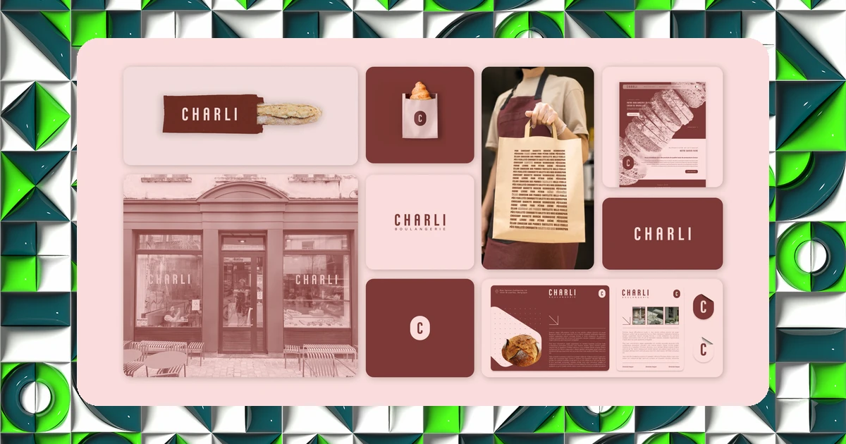
CHARLI is one of Brussels' best-known bakeries. Redesigning the identity of a brand with an already loyal customer base is a different exercise from creating one from scratch: you have to improve without wiping the slate clean.
Redesigning an already well-known brand
I was brought on to redesign the entire visual identity of CHARLI Boulangerie and everything that comes with it. The goal: to create a strong, memorable image, consistent across every touchpoint, to strengthen brand recognition and local customer loyalty.
The whole project was run in collaboration with the interior architect in charge of the store, a coordination effort needed so the graphic identity and the physical space would tell the same story.
A system, not just a logo
The work was built around a typographic logotype, carried across all the packaging and print materials. This purely typographic choice, with no accompanying symbol, bets on the strength of the name itself: a wager that demands flawless execution, since typography becomes the sole carrier of visual personality.
On the UX/UI side, the project was run in Figma with particular attention paid to accessibility and eco-production, two requirements increasingly present in the briefs of local businesses mindful of their local image.
It was a real pleasure working on this project with Florent! Always attentive to the client, responsive and rigorous, designing the visual identity was super smooth!
Client testimonial, CHARLI Boulangerie
A typographic logo has no symbol to fall back on if execution is mediocre: the typography, spacing and proportions alone have to carry the entire brand identity.
The results
The redesign produced a more impactful visual identity, with strong recall that directly supported customer loyalty. The consistency between packaging, print materials and physical space reinforced a sense of a fully realized brand, well beyond a simple logo change.
Want to know where your own brand stands? Take IDSEED's free branding audit: twenty questions to get an objective read on your current positioning.
Frequently asked questions
-
Should you redesign a brand that's already doing well commercially?
- Yes, if the image no longer reflects the perceived quality or the position the brand actually holds in its market. A redesign isn't a challenge to that success, it's an adjustment of how it's represented.
-
Why choose a typographic logo over a symbol?
- When the brand name is already strong and recognized, a well-executed typographic logotype can be more memorable than a generic symbol, provided every typographic detail is carefully handled.
-
How do you coordinate graphic identity and interior architecture?
- By working in parallel with the architect from the earliest sketches, so that colors, materials and store signage naturally extend the graphic identity rather than contradicting it.