

Machina Concept: a brand identity for a fitness app
 Florent Dabernat
March 10, 2026
3 min read
Florent Dabernat
March 10, 2026
3 min read
In this article
Machina Concept is a fitness app built around a triptych: mental, physical and nutrition. A three-dimensional positioning that had to come through both in the brand identity and in the experience of the app itself.
A brand for three pillars
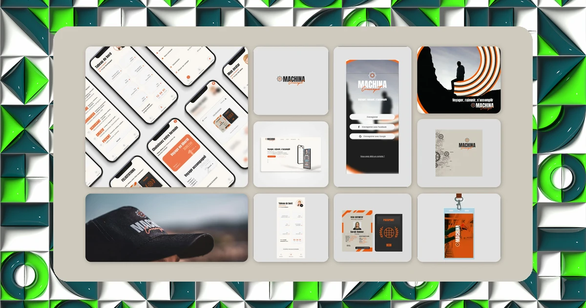
I was brought on to create the entire visual identity, the app, and everything that comes with it for Machina Concept, on a project spanning June 2023 to February 2024. The overall support in branding, graphic design and UX/UI design aimed to structure the brand image and create a clear digital presence, with a high-performing mobile app.
The mental/physical/nutrition triptych wasn't just a marketing argument: it had to run through the very construction of the identity, so that no one pillar would dominate visually at the expense of the other two.
From identity to textile
The branding work extended beyond the classic modular logotype all the way to textile design, a rare variation that reflects the project's ambition: bringing the brand to life on sportswear, not just on screens.
On the UX/UI side, the project covered both the website (WordPress, mobile first, SEO) and the mobile app itself, with a strategic UI designed to support engagement and regular usage, central concerns for a fitness app where abandonment after a few weeks is a constant risk.
Thanks to a consistent art direction and a strategic UI, the brand gained impact quickly: a sign that alignment between identity and user experience accelerates recognition, more than isolated visual work ever could.
A performance-driven approach
The whole project was built around three axes: performance, visibility and user experience. A common thread that guided both the color and typography choices and the information-architecture decisions within the app.
The results
Machina Concept now has a consistent brand identity, carried from digital to textile, supported by an app experience designed to sustain engagement over time rather than just the initial download.
Want to know where your own brand stands? Take IDSEED's free branding audit: twenty questions to get an objective read on your current positioning.
Frequently asked questions
-
How do you keep an identity consistent between digital and textile?
- By setting simple, robust rules from the start (a limited palette, a solid typographic system, patterns) that work as well in pixels as in screen printing or embroidery, without relying on effects that can't be reproduced on fabric.
-
What does a "strategic" UI mean for a fitness app?
- An interface that prioritizes what sustains long-term engagement (visible progress, non-intrusive reminders, immediate feedback) rather than settling for a nice welcome screen with no follow-through.
-
Do an app and a website need different identities?
- No, the identity should stay the same: logo, colors, typography. What changes is how those rules are applied to each platform's specific constraints (screen sizes, touch interactions, usage time).