

Racines: a premium identity for a Provence gardener
 Florent Dabernat
November 4, 2026
5 min read
In this article
Racines is the identity of a Provence gardener who wanted nothing expected: no generic green, no "nature" typeface, no spade and wheelbarrow. The brief came down to one word: premium. Here is how a root from old grimoires became the heart of a high-end brand.
A premium brief, far from the gardening clichés
The gardening sector is saturated with identical signs: green foliage, organic lettering, stylised tools. For a brand aiming high-end, that is a trap: blending into the crowd, and therefore selling at the crowd's price.
So the starting point was a clear constraint: tell a story, and something ancient. Not decorate a trade, but invent a world for it. That demand is what opened the door to a symbol no one uses in this field.
The mandrake, a territory no one owns
The mandrake imposed itself: a root in human form, the plant of old grimoires, a symbol of power and mystery for centuries. It literally links earth and legend, the gardener's trade and a premium imagination. A free visual territory, recognisable at a glance.
It becomes the brand's icon, treated as an engraving illustration, in a bold bright orange that cuts sharply against the sector's expected green.
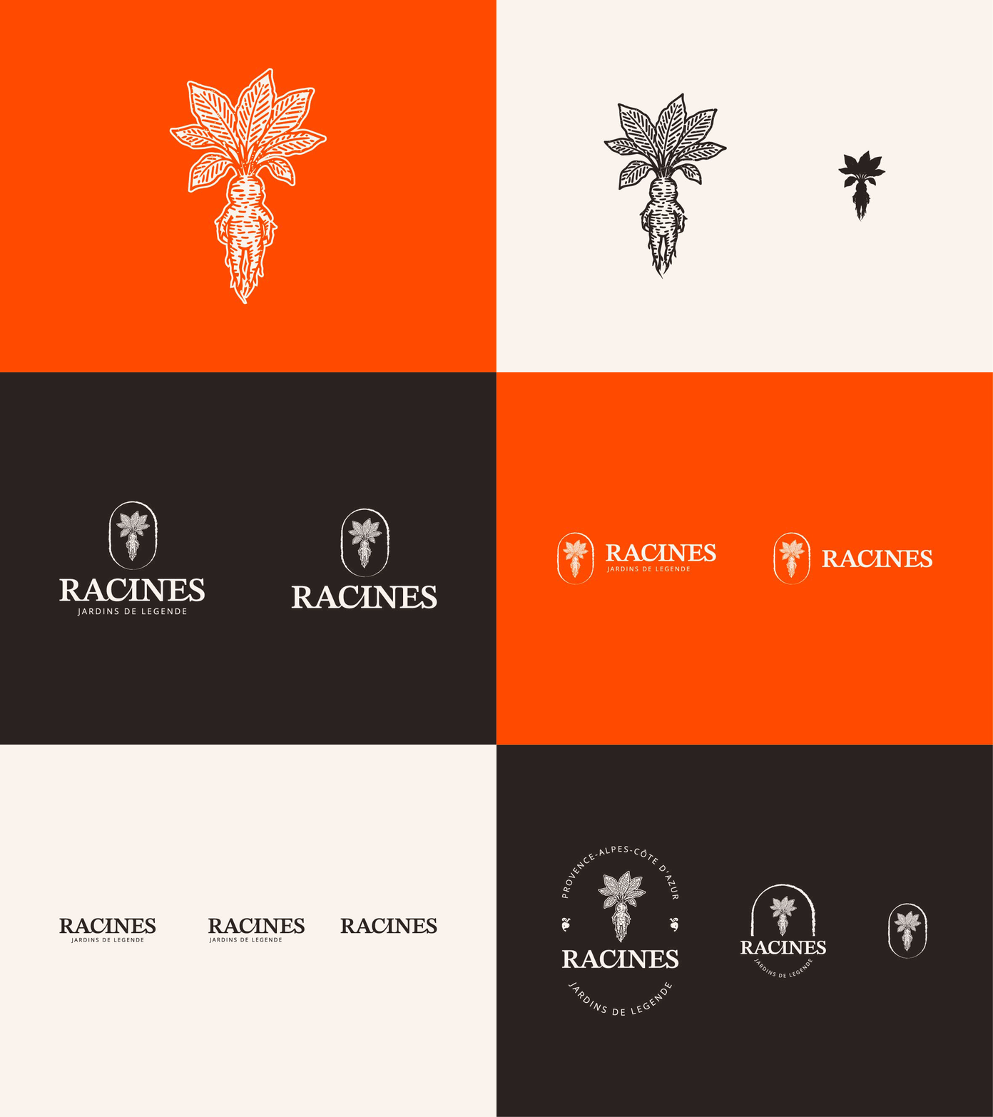
Strong high-end positioning turns an ordinary trade into a world of its own.
A responsive logo, the same energy at every size
Like a modern digital identity, the Racines logo is built to be responsive. It comes in three states depending on the medium and the size:
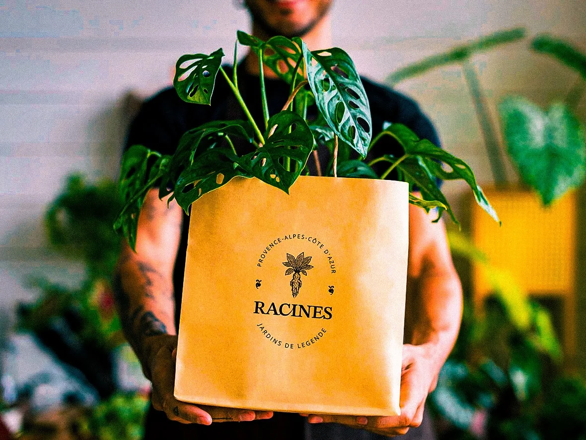
- The full crest, with the "Provence-Alpes-Côte d'Azur" arc and the "Jardins de légende" baseline, for large formats and official statements.
- The simplified stamp, which keeps the essence of the story, for intermediate media.
- The icon alone, the mandrake, for small formats and signage uses.
At every scale, the same energy: nothing is diluted, nothing is weighed down. That is the condition for a brand that lives as well on a seed packet as engraved in a garden's soil.
A coherent system across every touchpoint
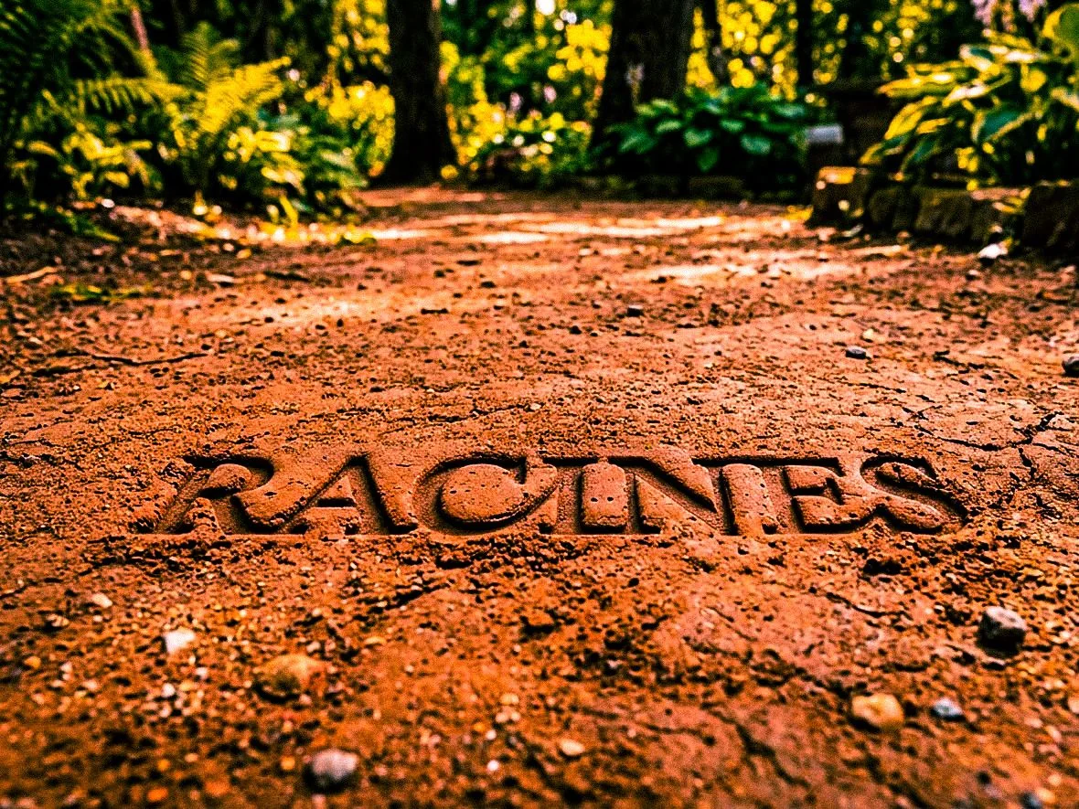
A premium identity is not judged on a logo in isolation, but on how it holds everywhere. The Racines system is applied to physical media and packaging mockups with the same grammar: bright orange, serif typography, engraving illustration and a shared photographic treatment.
That treatment is a deliberate stance: every image goes through the same warm, film-like filter, saturated colours, strong contrast and a light vignette, close to a camcorder or analogue photo. It pulls the brand towards the nostalgic and the timeless, and gives substance to the "Jardins de légende" promise.
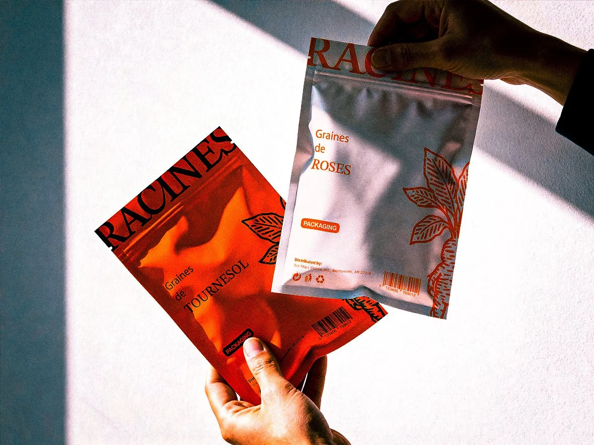
A detail carried all the way into use: tearing the packet open cuts the mandrake in two, leaving only its roots, that is, the brand's name (Racines). The object replays the logo every time it is opened, turning an ordinary gesture into a signature.
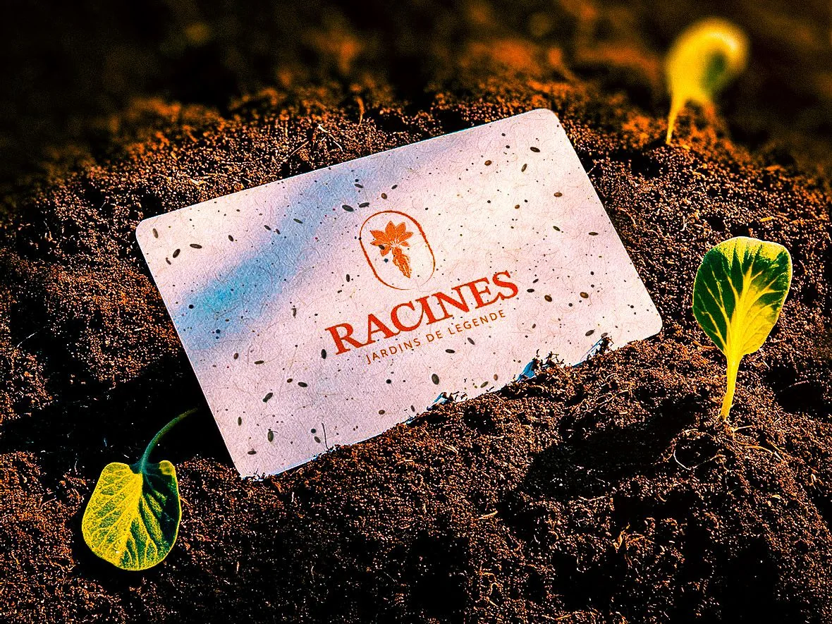
The business card is printed on seeded paper: planted in the soil, it sprouts and grows into a plant. The brand does not just talk about gardens, it literally takes root with the client. One last nod to the name, Racines, and to the brand's promise.
Pick a symbol no one owns, make it responsive, then apply it with a strict grammar: that is what separates a high-end brand from one more logo in a saturated field.
You run a business too quickly filed as "ordinary", and you want a brand that finally tells your value? That is exactly the work I do with my clients, from the visual territory to the touchpoints. Start with IDSEED's free brand audit.
Frequently asked questions
-
Why choose a symbol as unexpected as a mandrake?
- Because the gardening sector is saturated with green foliage and "nature" typefaces. The mandrake, a human-shaped root from old grimoires, is a free, premium and memorable territory that links the gardener's trade to a world of legend.
-
What is a responsive logo?
- It is a logo designed in several states depending on size and medium: here a full crest, a simplified stamp and the icon alone. Each version keeps the same energy, so it stays legible on a large sign as well as on a small seed packet.
-
How does an identity stay coherent across every medium?
- By setting a strict visual grammar and repeating it everywhere: for Racines, the bright orange, the serif typography, the engraving illustration and a warm, film-like photographic treatment shared across every image. From packaging to business card, every medium applies the same rules, which makes the brand recognisable at a glance.